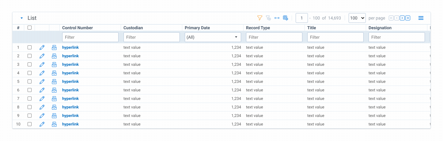
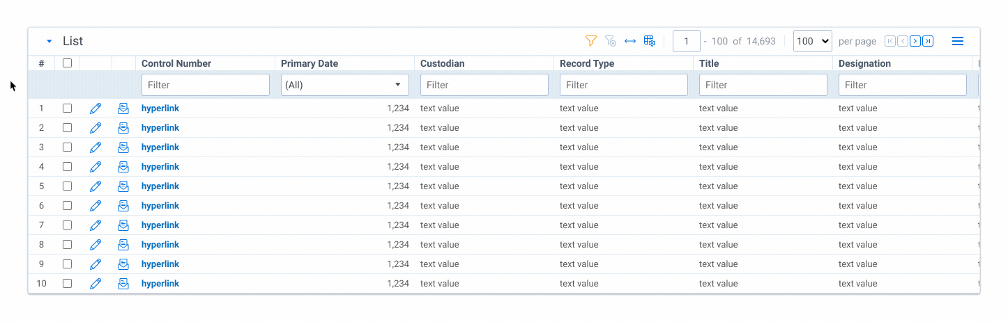
The list page is the backbone of the Relativity platform. It is the base from which everything else is built, yet outdated functionality and poor organization keep it stuck as a merely an entry point. In 2020, we set out to transform the list from a static display of information to a high performing workflow-driver.
After working for several years on Analytics, I was provided an opportunity to switch products and expand my role. In July of 2020 I joined the Search vertical where I have helped build the team, define the vision, and influence the roadmap. The foundations of this vision are:
The project is still in the early stages, but it is some of the work I'm most proud of and the early results are very promising. This work is the foundation for massive improvements to Search in 2021 and beyond.
As we defined the multi-year vision for Search, we identified the three high-impact problem areas to focus on in 2021. Addressing these areas provide a step function improvement for the user experience and set us up for the future-looking work we have planned. They connect the dots from the software today to the vision for tomorrow.
This case study is focused specifically on problem 1. The Simply Powerful Search case study focuses on problem 3.
From the outset I approached this work like a science project. Using user data and feedback as a foundation, I framed the problems and formed hypotheses to improve the experience. Based on these hypotheses I am creating design explorations and working with the UX Research team to to test them, iterating until we've validated an optimal solution.
My top priority throughout this project has been to ensure that the user is at the center of everything we do. Every problem we solve is framed by real world use cases, explorations are informed and scrutinized by internal and external experts, and solutions are tested and validated by the people who use them.
To get the volume of user input we need for a project of this size—one spanning 12+ months—we decided to form a user advisory board. This board is comprised of a variety of user types across key customer segments, all of whom have committed to:
representing 3 primary user types
of varying size & sophistication
identified as high priority
The landscape of Relativity users is highly varied and diverse, but for our purposes the user types can be broken down into three major buckets across two axes: level of sophistication and type of work.

These three user types are highly representative of the majority of Relativity users and serve as useful context when exploring new features.
Through a combination of user interviews, quantitative usage metrics, and anecdotal feedback we identified three leading causes for confusion on the List Page:
An audit of search functionality on the List Page provided vivid clarity around our users' grouping complaints—by default there are nine different areas containing search-related features. To make matters worse, they are scattered throughout the interface without much proximity or grouping. In this case, a picture says a thousand words.
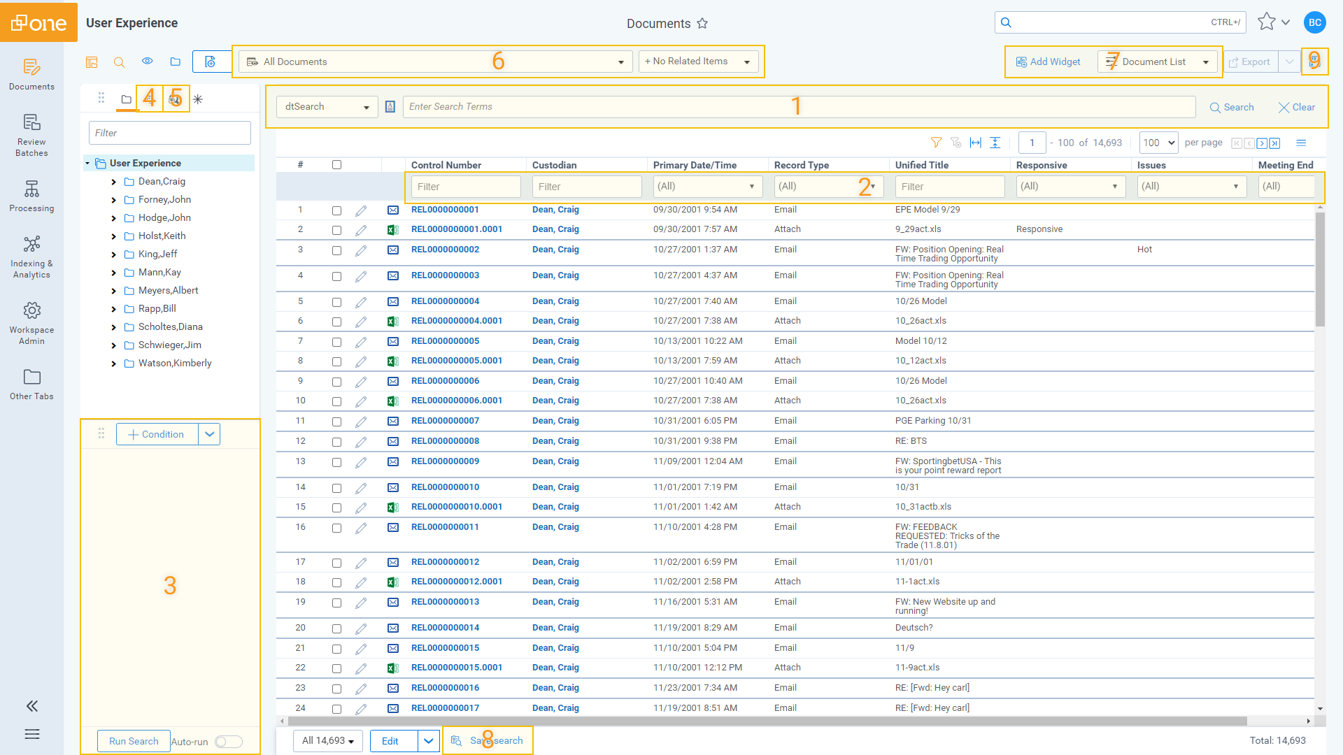
A quick look at the usage data of just the page header painted a pretty clear picture: a lot of these features are barely being used.
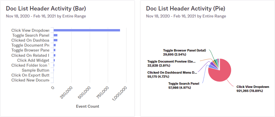
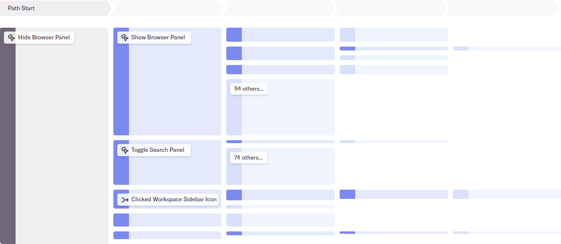
Clickstream analysis revealed further issues with the header: similar functionality was causing errant navigation.
Our early research has generated a few key hypotheses that are already yielding promising results in early explorations:
This early exploration executes on the hypotheses stated above and illustrates how a few targeted changes can dramatically reduce UI complexity with no functionality loss.
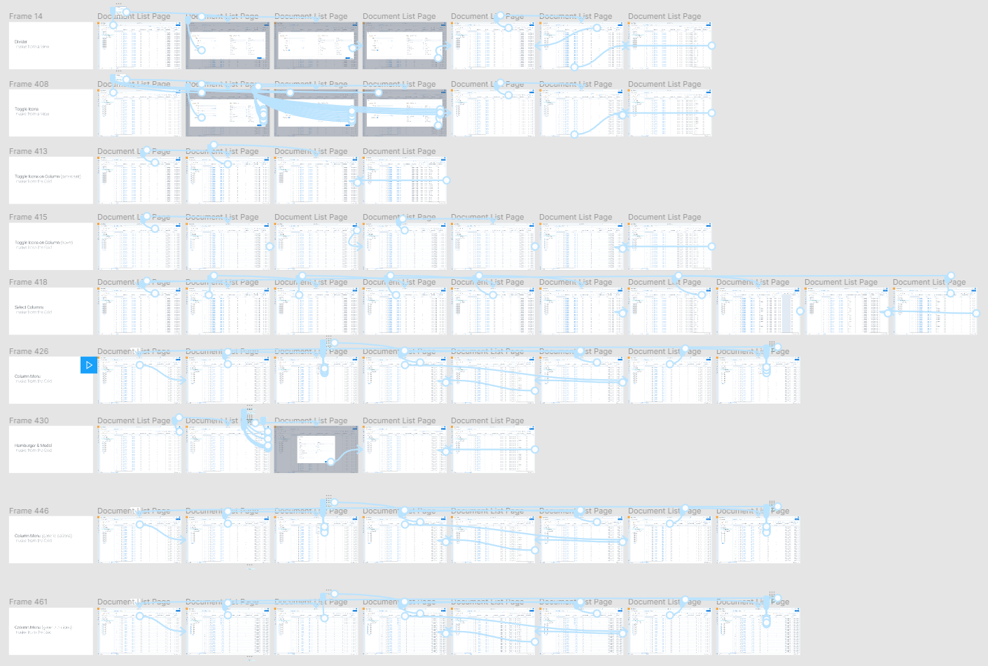
Coming up next for this project is continued exploration and the typical prototype-test-refine loop as we strive to simplify the List Page. Alongside that, we are also starting some more tactical, feature work—addressing problem 2 mentioned above—to make the list component a more robust workflow-driver. Below are a handful of other explorations I've engaged in for our next feature: freeze columns.