
May 1st, 2015 (Relativity 9.2)
November, 2014 - Present
PM: Bill Bailey
BA: Elise Tropiano, Matt Bilan
User Experience Designer
User Research
Low Fidelity Wireframes
High Fidelity Mockups
Interactive Prototypes
Style Guidelines & Final Assets

You are a giant technology company. You have hired thousands of employees around the globe, and together you've built engaging and delightful products beloved by everyone.
But...
There's always a catch, isn't there? It turns out your most hated competitor— they're the worst! — is filing a copyright infringement lawsuit against you and your flagship product. Regardless of the fact that the suit is totally unfounded, you are now on the hook for collecting and maintaining all of the documents that might be relevant to this lawsuit.
Think about that for a second. Every single Word document, PDF, Email, Photoshop file, etc. from any employee who has ever worked on your flagship product in any capacity. That could be millions of files! It gets worse: you are responsible for sorting through all of their documents, removing the noise, and turning over only the files relevant to the case. That is going to take forever; you have one month to get it done.
Big data in litigation is boring. Worse than that, it's expensive and fraught with inconsistencies and errors. Law firms and corporations are spending billions of dollars to manage an antiquated, linear document review* process, throwing as many bodies at the problem as they can afford. Allow me to reiterate this: the biggest, most advanced law firms and technology companies are paying rooms full of lawyers to sit at a computer and manually review millions of documents, one at a time, document-by-document. This isn't sophistication, this is brute force.
Data analytics* offers a dramatic improvement on this old model, but it's not without its problems:
By utilizing analytics technologies like Clustering*, these same companies can identify and prioritize important documents while streamlining review; we just need to give them something they can and want to use.
Customer Research and Feature Definition
I worked alongside a PM and two BAs to identify all of the touch points in our users' existing workflows, any pain points in the process, and where the current experience breaks down. We identified the primary consumers of this feature as well as their key use cases. We translated this data into a prioritized list of features and workflows that Cluster Visualization was built around.
Data Visualization Strategy
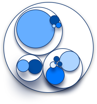
I did intensive research on data visualization methodologies and best practice. Based on said research, the requirements of the visualization, the type of data we were trying to display, and our users' mental models, I selected a visualization type (circle pack) and defined a data encoding strategy (sequential hue, choropleth map), and color palette.
Interaction Design
I explored and created different interaction schemes to best align with the visualization and the users' goals. I started with quick, low fidelity prototypes, refining and iterating based on internal and external feedback, and ultimately produced high fidelity mockups and prototypes illustrating key interactions and workflows.
Visual Design
I was responsible for all facets of the visual design of Cluster Visualization. I defined the look and feel of the visualization itself, color palette for the clusters in all of their various states, treatment of the text, the legend and all of the controls, the iconography, etc.
Usability Testing
I worked with internal subject matter experts to do initial testing and validation of designs and workflows. I defined goals, tasks, and scenarios, recruited users, and performed user interviews and usability tests on internal and external stakeholders to provide data to inform difficult decisions and to validate existing designs.
At the outset of the project, we conducted customer research to better identify not only what we needed to make, but who we needed to make it for. We had already created a robust set of personas, however customer interviews quickly revealed two key user segments who would be the primary consumers of this product.
The Lit Support Pro
The Lit Support Pro* supervises and oversees the setup and maintenance of a case as well as the tech support of the litigation team. They generally serve as the administrator of Relativity*.
Goals:
Frustrations:
Desires:
Responsibilities:
The Elevator Pitch
As a lit support pro, I want to quickly understand my corpus of documents, identify and prioritize those that are most relevant, and quickly perform QC in a way that is visual and intuitive so that I can save money on review costs and feel confident in my production.
The Reviewer
The Reviewer* is an attorney who reads through electronic documents in order to determine their relevance to the case with a heavy emphasis on efficiency and accuracy. They make up the largest segment of the Relativity user base.
Goals:
Frustrations:
Desires:
Responsibilities:
The Elevator Pitch
As a reviewer, I want to be presented with the most relevant, conceptually similar documents so that I can increase my review speed and accuracy to exceed the expectations of my employer.
With the personas and use cases laid out, the next challenge was to define a visualization strategy that both addressed the needs of these users and also fit into Relativity's new visualization framework. There was only one catch: it didn't exist yet... More on that later!
To begin, I did a deep dive into data visualization methodologies and best practice. I focused my studies specifically on color selection, visualization types, and data axes/encoding strategies. These are the key takeaways:
Color Selection
Visualization Types
In order to properly display the structure of the cluster, we needed something that allowed for hierarchy and exploration. Additionally, we needed to be able to layer in various other pieces of data (i.e., size, similarity, hit density, titles, etc.). Further, as part of the technical requirements of the visualization, it needed to be powered by the D3 JavaScript library. Based on these requirements, I investigated the following visualization types:
Encoding Data
There are many ways to encode data in a visualization, however the most successful and easily processed utilize the preattentive attributes of visual perception. Being selective and using these attributes to define the most important axes of data can create a visualization that is more legible and digestible. These attributes include:
Form
Color
Spatial Position
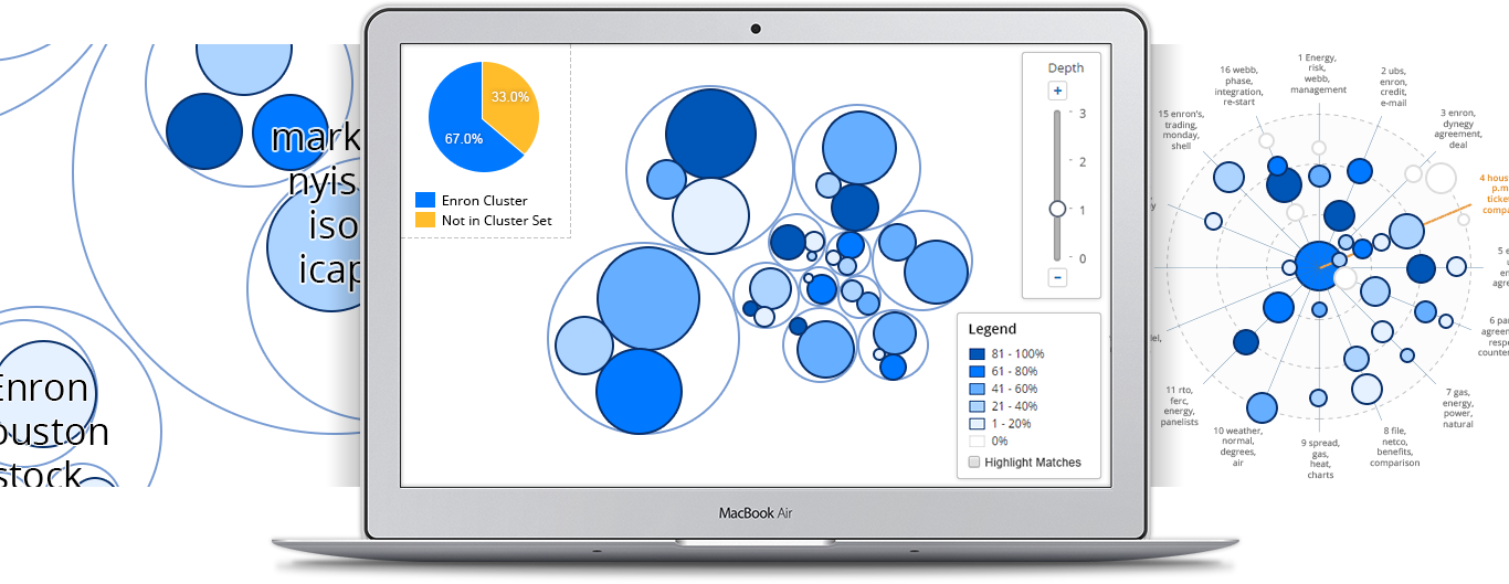
Part of Relativity Analytics, Cluster Visualization displays your data as a map of conceptually similar documents. Inject more speed and consistency into your review or investigation by uncovering potentially relevant clusters and related content. Cluster Visualization enables quick exploration of your data, highlighting those items that are most important to your review.
Instant Insight
Explore your data. Whether during early case assessment or in the throes of review, quickly drill into clusters to gain a high level understanding of your case, no matter the size. Gone are the days of struggling though incomprehensible data tables. Quickly dive in and get your hands dirty using Cluster Visualization's intuitive controls and visual display.
Bring Order to Chaos
Organize your documents. No matter how you slice it, the staggering data volumes of a new case can be an unwieldy nightmare. How do you get organized? Where do you even start? Use Cluster Visualization to bucket, folder, and distribute documents for a more efficient review process.
Focus on What Matters
Prioritize your review. Quickly filter, identify, and tag the most important and impactful documents in your case. Using the filter heat map know immediately which clusters are high priority and which are not.
Get it Right the First Time
Perform quality control. Identify missed documents and coding inconsistencies by comparing conceptually similar clusters. Have a really hot cluster? Make sure all similar clusters are coded consistently.